
Although there's nothing on the cover showing that he's Jewish, the author of this librarian bio is a" member of the tribe". The use of different color to form his face is interesting enough, but when you look closely at certain angles, you can see that his face is made up of due dates from a stamp.

Lots of Magen Davids here, but the small size and their use as snowflakes makes it subtle and the Civil War imagery is equally subtle.

I would classify this cover as another mundane white-lettering-on-black-background cover ... except for the small-but-conspicuous anti-Semitic box of graffiti above the title, made all the more noticeable due to the sparseness of the page.

The Magen David by itself would have been trite, but the octagon in its center is used to contain the Arab symbol, which is both visually interesting and metaphorical.

This time, the octagon of the Magen David has an eye peeking out at us, while a finger pushes back an edge of the star.

Visually, there's a lot of images thrown into this collage, but the use of colors, shading, and arrangement make the cover seem more inviting than "loud".

The blurring of the houses on the countryside, as well as the sharpness of the schoolhouse's colors make the schoolhouse the focus for the eye, even though it's not that big on the page.

Notice with this cover that there are 17 words describing the book, yet the designer has managed to fit them all in - and with different font sizes - without making it look cluttered.

I'm showing this cover as an example of what wraparound covers can do. The protagonist looks brave enough, in that he's risking getting arrested, should a Nazi return to the car while he's still there. But ...

once we see the rest of the cover, we realize that it's a riskier move than we might have thought, since a Nazi is standing right there beside the car. As a marketing gimmick, wraparound covers are great for 2 reasons. First of all, the book has noticeable imagery whichever side is facing you. Secondly, since you can tell that the picture is incomplete, you feel compelled to pick the book up and see the other half. Once you've picked it up, you might feel intrigued enough to read the plot summary, skim the pages, etc. ... after all, you're holding the book now.
I should add that since the covers of the Resistance books are original, they act as a "bonus", not giving away anything from the stories themselves and leaving it to the reader to imagine the before-&-after of the scene since it's apart from the story inside.

Once again, here is an example of a title word deliberately broken up, but this time it is meant to be symbolic, not just a gimmick.

This cover is rather plain-looking, but the red background makes it stand out a bit and the italics of the word Etiquette (which is also underlined) make the book a little more interesting than blander covers I have seen. This is an example of how a few modest choices can draw attention to a book without the need to be flashy or extravagant.


Here are 4 examples of inserting the Magen David into the American flag. I would have thought that such imagery would be used by the neo-Nazis, but they seem to prefer to use toilets.

For this cover, the designer obviously took his cues from the title. Nonetheless, the 4 images seem to be from 4 different sources. So, choices had to be made about which image to use and how to crop each one. The word "Torah" is not in the title or description, but the 4th image balances out the other 3 and let's us know that this is a Jewish book.

The Magen Davids in this cover not only signify that this is a Jewish book, but represent Israelis and Jews with a tiny link between the two Magens representing the link between the communities.

In the same way that sheitels hide a woman's true hair, the hair of the woman on the cover is mostly hidden, in that only a portion is shown.

This cover has just the right mix of comedy and Jewish iconography.

This cover image would simply be a bland photo of the Israel Museum, if not for the gigantic question mark looming overhead.

This would also be a bland cover, except for another oversized question mark as well as putting the word
G-d in a very large font.

Here, the question mark is lying on the psychoanalyst's couch. While questions marks are not an obvious Jewish icon, Jews are said to be a people who answer a question with another question. So, I guess it's appropriate.

This cover would look rather bland if not for the colored banners on each line. Simple, but eye-catching.

Here's the cover of a book by AJL member Linda Silver. It's quite a minimalist cover, proving again that a cover need not be complex, expensive, or gimmicky to both convey a message and get noticed. The "K" in kids is written in what could be called "children's font" and each of the figures in what looks like the cutout men preschoolers make in arts & crafts, is a different color.

At first, this looks like just another Magen David .... except this one's made of rubber chickens.

I
t's not often that I describe an image as "funky", but I think that's the right adjective for this one. Quite appropriate for a book on folk art.

This is just another example of an image of Jews praying at The Kotel. Except that they're not praying ; they're reading. And what they're reading are graphic novels.

Just another day at the beach .... with a Torah and tallis.

Another simple, yet eye-catching cover. 2 figures create 3 colored shadows, with a coffin in between them where the shadows intersect and a white Magen David where there shouldn't be, but the designer obviously wanted to make it clear that this is a Jewish-content book.

Another baseball cover. But this time, it's for a baseball story. The Magen David is small, but noticeable, since it has that beam of light shining from it.

Pretty straightforward cover with the slapstick guy-with-a-yarmulke slipping & falling representing humor and the Torah scroll grabbing him representing ethics.

At first glance, I didn't notice anything special about the cover and then saw that the top arrow has a quote - in English - by JS Mill, while the lower arrow has a Hebrew quote.

What can I say about this cover? These are the cutest-looking anthropomorphic Jews I've ever seen on a book cover.

Personally, I would tend to assume that a book about Jewish law - even one aimed at the younger set - would have a mundane-looking cover. I'm delighted to be wrong. This one is cute, colorful, and to-the-point.

There seem to be plenty of books about Jewish views of sex and love, but I don't think too many of them have tried to merge the heart symbol and the Magen David as this one does. Plus the couple does look lovestruck.

I'm sure many of us are already familiar with Art Spiegelman and his Pulitzer-winning graphic novel. Now, let's pretend that we never heard of the book and are looking at this cover for the very first time. The artwork is simplistic, but cartoonish, so we might assume that this is a book of comix illustrations. The mice don't look Jewish, but there are 3 visual clues about what's inside. The title - Maus - uses the German spelling, not the English one. And it's drawn to resemble dripping blood. These 2 aspects, along with the swastika, suggest that this is a Holocaust book. However, a stylized cat head is integrated into the swastika and that tells us that there seems to be a cat-vs-mouse metaphor in play, in addition to this being a graphic Holocaust book.

Here's one of the not-so-subtly but no-so-explicit non-nude covers I was referring to earlier. Sometime a pair of melons are just that... but usually not on book covers.

This book may deal with sexuality, but that doesn't necessitate putting anything suggestive or explicit on the cover. There's enough Jewish iconography to tell us it's Jewish, along with same-gender pairings to tell us that it's about gays & lesbians.

There's not a lot of colors used in this cover, but the ones that were chosen complement each other very well.

Here's another example of a matzoh ball soup cover ... with one of the balls morphed into an eerie skull. And the requisite Magen David above the "i" in mitzvah.

More matzoh ball soup, this time with a crumpled up paper from a writer's "rejection" pages.

I have to admit that when I first saw this cover I thought the "A"s were supposed to be flames, as in shabbos candle flames. Then, I learned that they are supposed to be Babushka dolls, which makes more sense since the book has stories about Russian Jews in Canada.

A very simple cover that combines Jewish food and a smile.

Another not-so-subtle cover by the same people who brought you the pair of melons.

This is a cover that won't be appropriate for certain libraries. Even if her bra wasn't showing, the sight of a woman wearing a tallis will be considered unacceptable to more traditional patrons.

This is a bit of a shocking cover. Not too many publishers would risk combining the swastika and the Magen David. I'm not saying it's right to do so, but it certainly gets one's attention.

Our friend the atom makes another appearance, but given the title of the book, I can't really think of another juxtaposition of images that would work.

The bizarreness of the chassid using a gun (even if it is a toy) as a pointer caught my attention and made more sense once I read the subtitle.

Another book by one of our AJL members. Simply a keyboard and a Magen David. Rather than using the usual straight-ahead or looking down angle, we see the keyboard tilted away from us, like we're looking up at a mountain. It's certainly more original than many of the computer-related books I've seen.

Before anyone gets the wrong idea, this is not one of my favorite covers. It's too vulgar, plus - though it's drawn by Miriam Katin - (who is Jewish), there is nothing Jewish about the cover at all. But this is just the front. Sometimes, the back of a wraparound cover is better than the front and I think this is one such case.

This cover is both less vulgar and more detailed (in a Will Elder sort of way).
Going from the bottom of the page upwards, there is the Hebrew transliteration of "bar code" above the books barcode. 3 tzedakah boxes. A pair of Jewish mice studying (one mouse is wearing a tallis). The circle K on the waitress outfits which matches the Ks being stamped on the food in the kitchen (by a yarmulke-wearing anthropomorphic pig). There's a menu below the hanging sausages which includes a "shabbos special". Finally, there's a self-portrait of the author as a child, though one doesn't know that until reading the story inside the book.

W
e're probably all familiar with the Uncle Sam posters, but probably haven't seen this Jewish version.

While there are the usual symbols of teaching on the desk (the apple, pens, ruler), the cover shows us that it's modern by including the desktop and mouse on the side. There's also a Hebrew book under the apple (though the title isn't clear), as well as a self-referential copy of the book on the other side.

It's not so easy to figure out what this book is about, but the best clues are the map of New York at the top and the Magen David in the number "2". The book has essays and stories about 23 Sephardic Jews who sailed from Brazil to Manhattan in the 17th century.

It's not easy to represent bi-cultural Jewish mindsets, but the designer decided to use English and Hebrew words inside a guy's head and I think it works well.
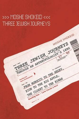
With a title like "Three Jewish Journeys", it's logical to use the font style and imagery of plane tickets.
Here, the designer cleverly plays with the fact that both words in the title begin with the prefix "trans" and simply reverses the italics from one line to the next.

Another computer-related book with a photo of a computer. However, the screen shot of the Torah tells us that the book is Jewish.

There are plenty of business books showing men carrying briefcases. This may be the only one where the briefcase is made out of a copy of Talmud Bavli.

There is such a thing as trying too hard by using too many font styles and sizes on a cover, but I think that this cover has just the right mix.

Another Torah scroll cover, but with the addition of the stethoscope, we know that it also deals with the world of medicine.

With this cover, the image of St. Louis is cropped into an octagon to fit nicely into a faded Magen David.
Finally, I have put together a series of 11 colorful covers. The use or absence of color doesn't necessarily separate the good covers from the bad ones. I have seen colorless, but effective covers, as well as colorful covers that just didn't work for me. However, the following 11 are ones which I personally find to be pleasant and effective.


No comments:
Post a Comment